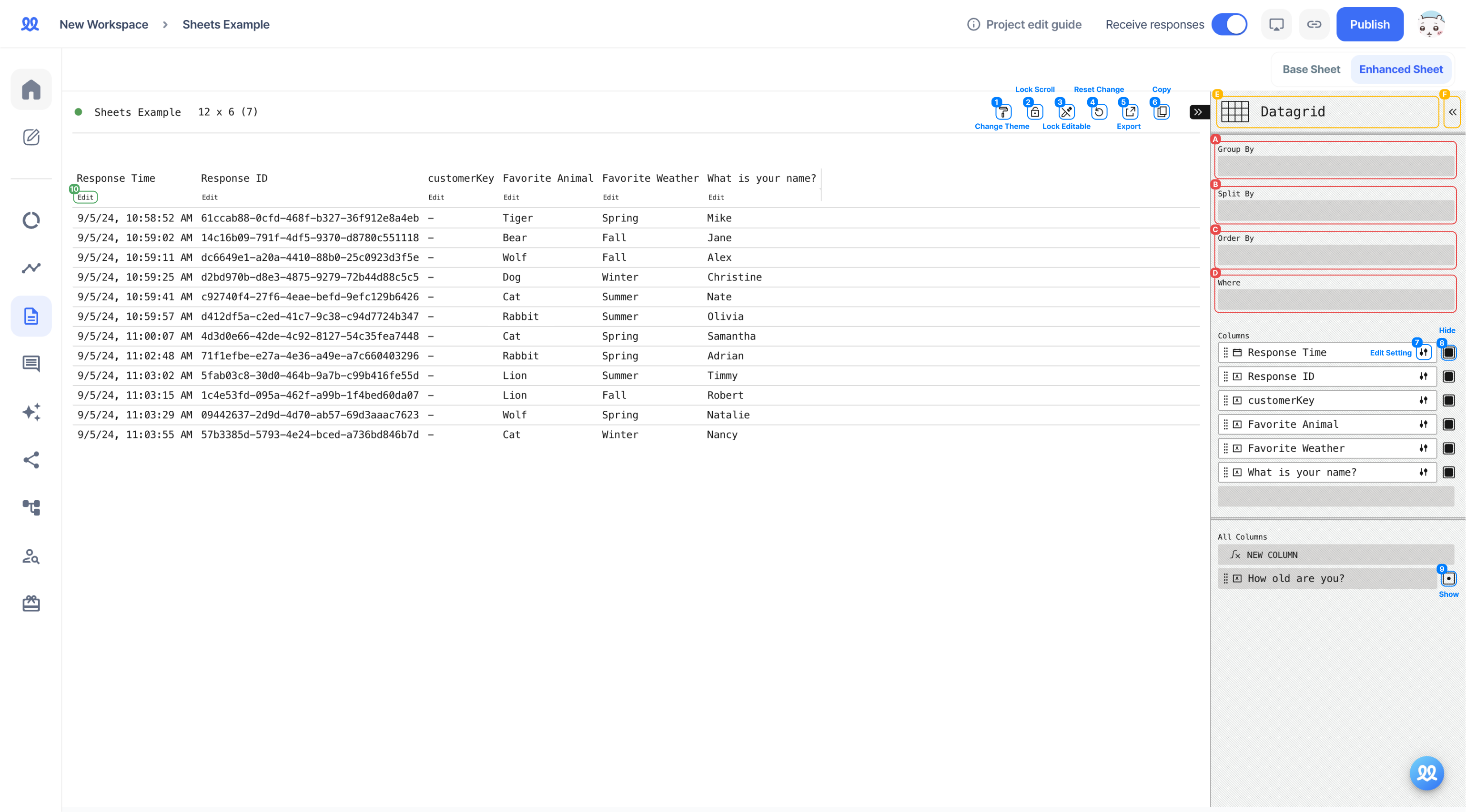
(1) Theme Change (currently unavailable)
(2) Scroll Lock
- Free Scroll: Free direction scroll
- Align Scroll: Fixed direction scroll
(3) Edit Lock (currently unavailable)
(4) Reset: Reset settings
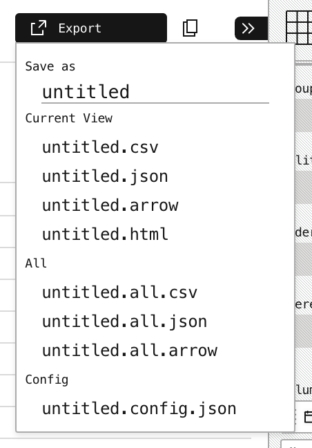
(5) Export
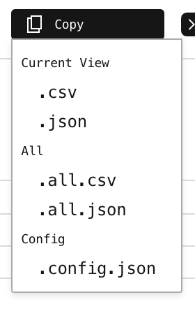
(6) Copy
(7) Edit
- Format: Set bold, italic, and hyperlinks
- Color: Set column text color, background color
- Timezone: Change the base timezone of timestamps
- Date Style: Change the date display format
- Time Style: Change the time display format
(8) Hide
(9) Unhide
(10) Edit: Same as (7)
(A) Group By: Group multiple data fields together
- For example, grouping by age and favorite season allows you to quickly see responses such as under 19 and likes spring or ages 27-30 and likes summer.
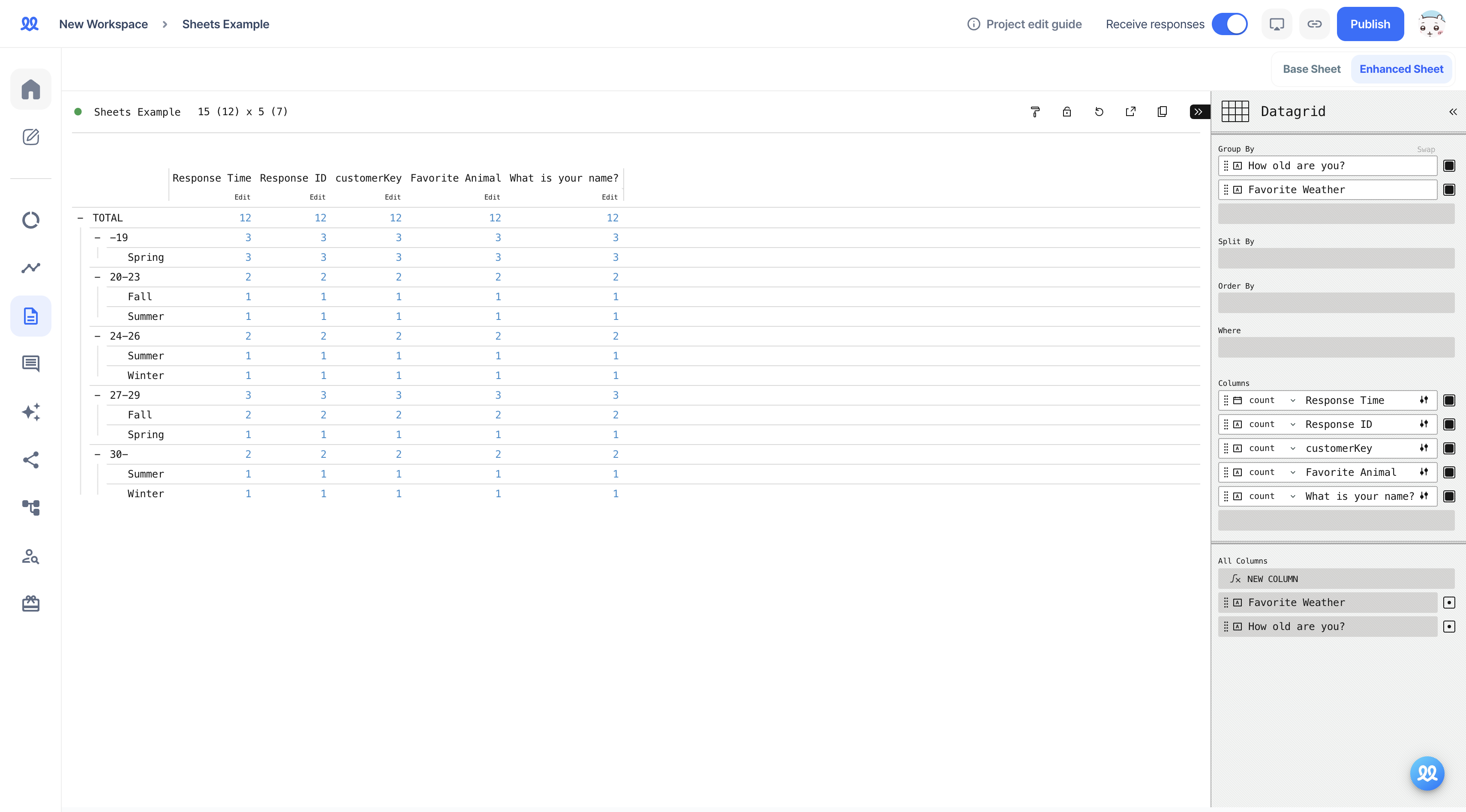
- You can see that the columns have changed accordingly.
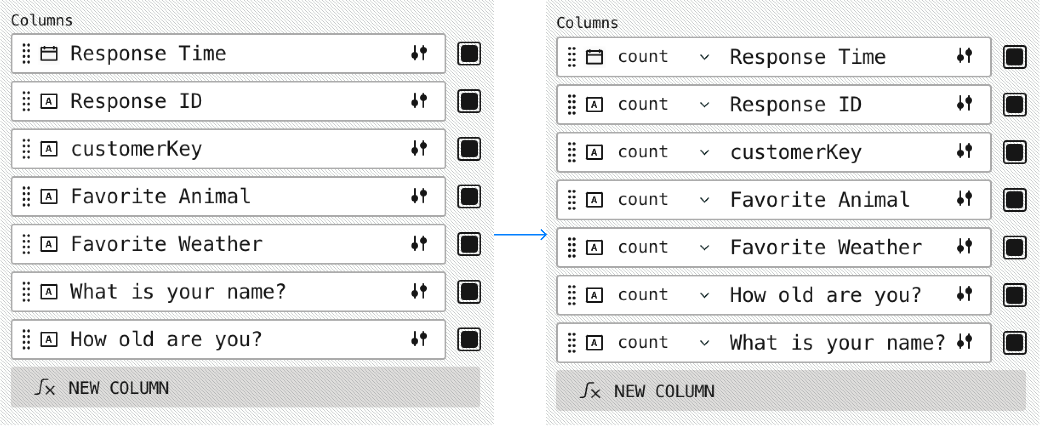
In this example, the values are shown as numbers because the Count setting is applied. However, you can change this setting to display various values.
- any: A random value from the responses that meet the condition
- count: The number of responses that meet the condition
- distinct count: The number of distinct responses that meet the condition (i.e., the number of unique joins)
- dominant: The most frequent response among those that meet the condition
- first: The first submitted response that meets the condition
- join: The types of responses that meet the condition without duplicates
- last: The last submitted response that meets the condition
- last by index: The last value submitted among the responses
- median: The median value when the responses are sorted by the condition
- unique: Responses that have a single distinct type
(B) Split By
- Previously, the title column displayed response time and questions. With Split By, you can change what appears in the title column.
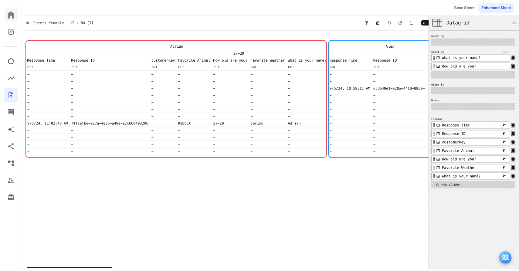
Setting Split By to "Name" organizes the sheet by respondent's name.
(C) Order By
- You can use Order By to sort the sheet based on a selected field.
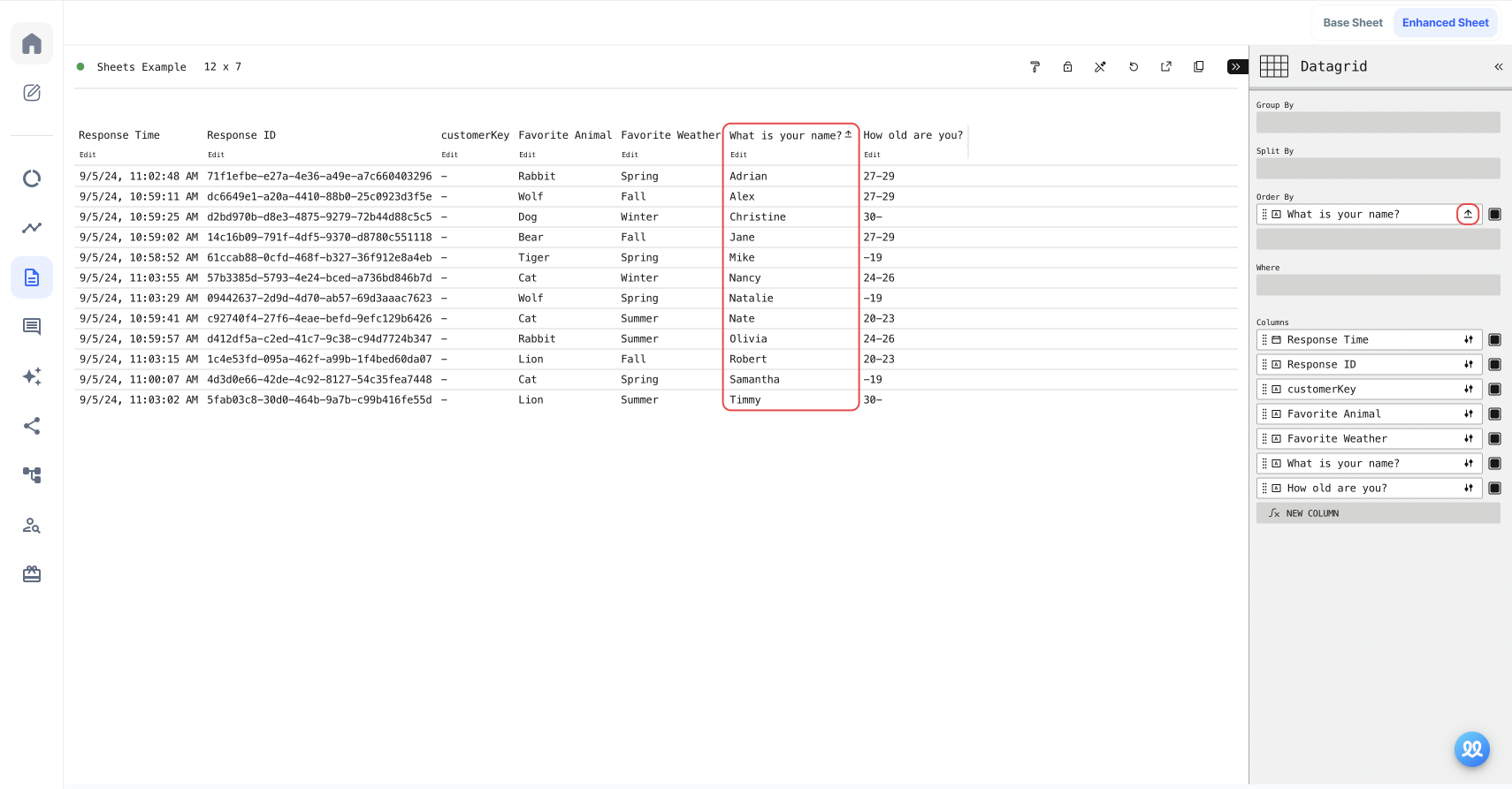
For example, setting Order By to "Name" sorts the data alphabetically by name. You can also click the red icon on the right to toggle between ascending and descending order.
(D) Where
- The Where setting filters the responses to show only those that meet the specified condition.
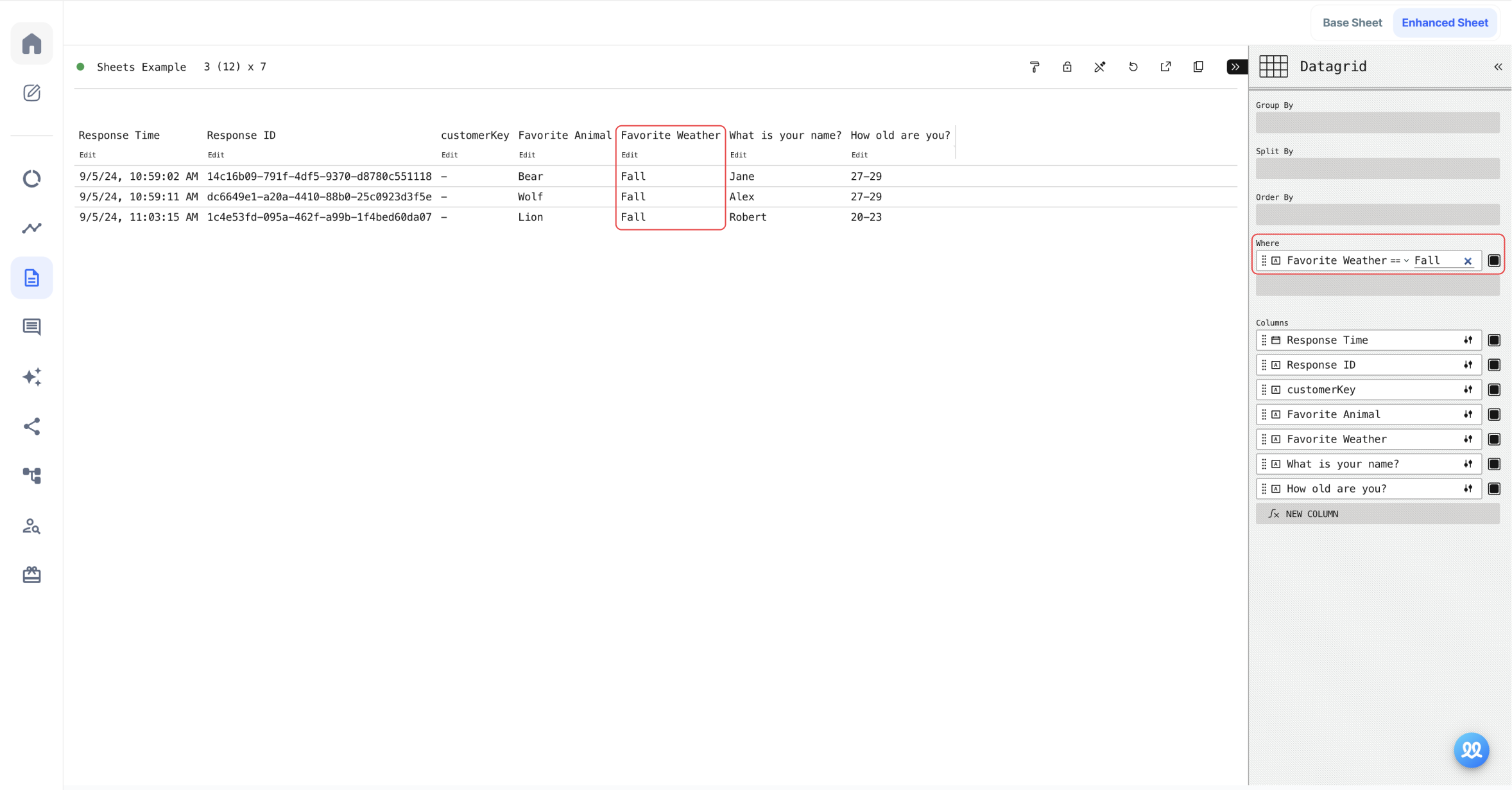
For example, setting Where to "Favorite Season" and specifying the value as autumn filters the sheet to display only responses that include autumn.
(E) Change Chart Type
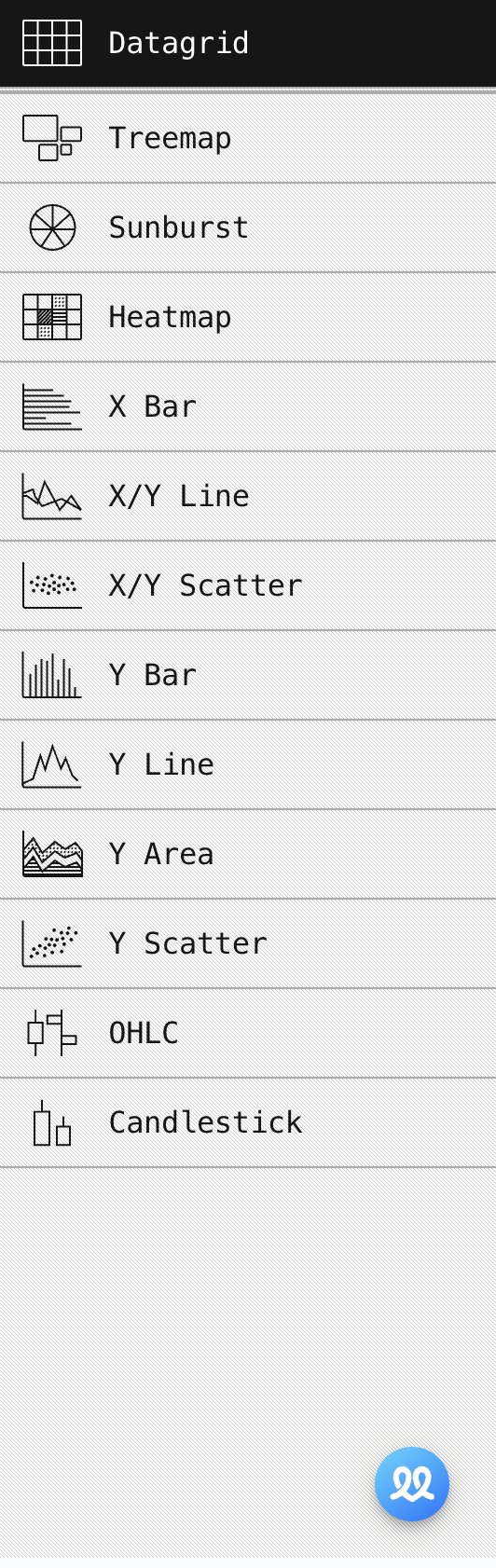
- Datagrid
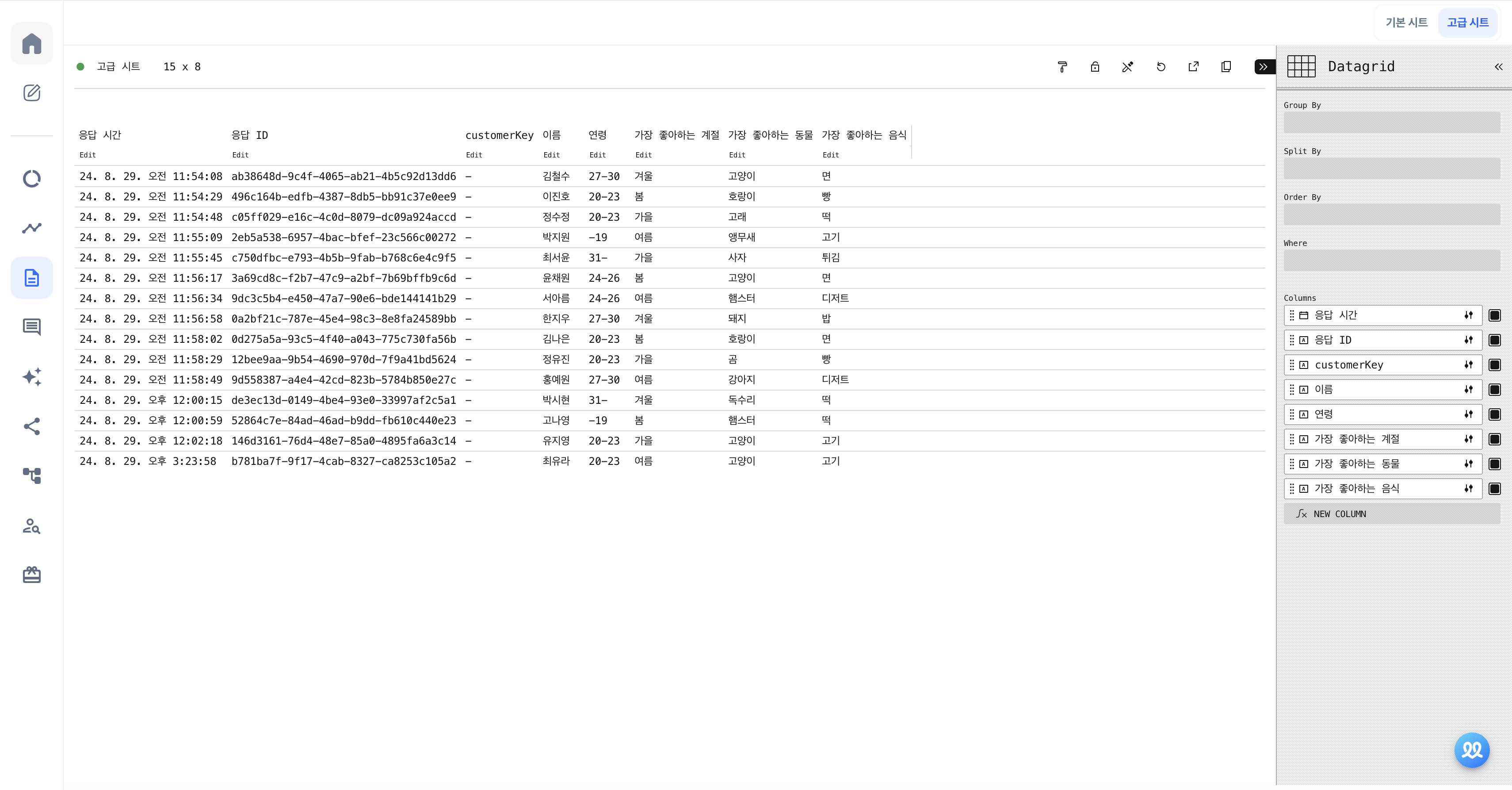
This is the table format chart type that we've been looking at so far.
- Treemap
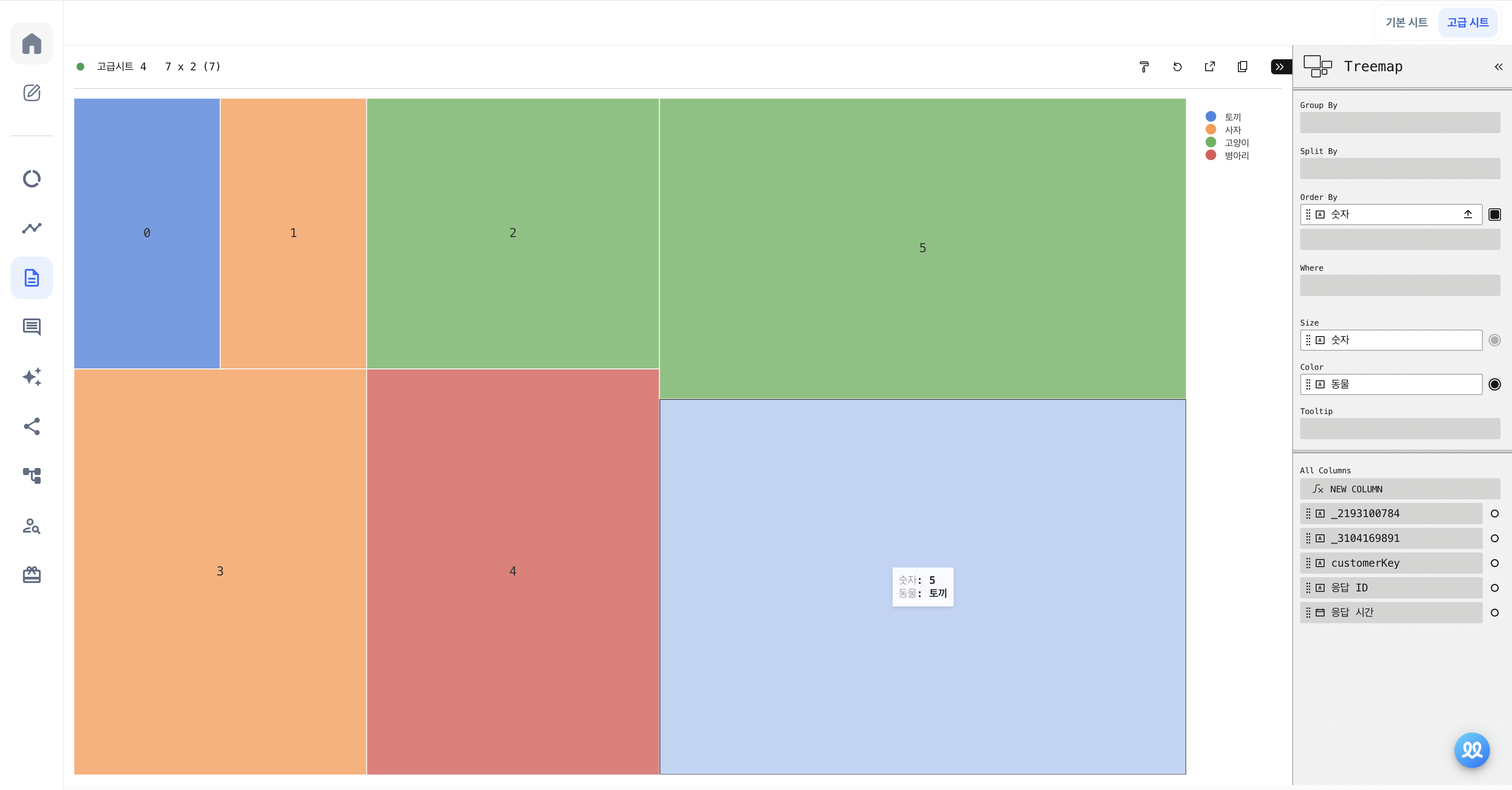
A Treemap is a type of chart used to visualize hierarchical data, displayed as nested rectangles. The color and size of the rectangles make it easy to visualize the data.
- Sunburst
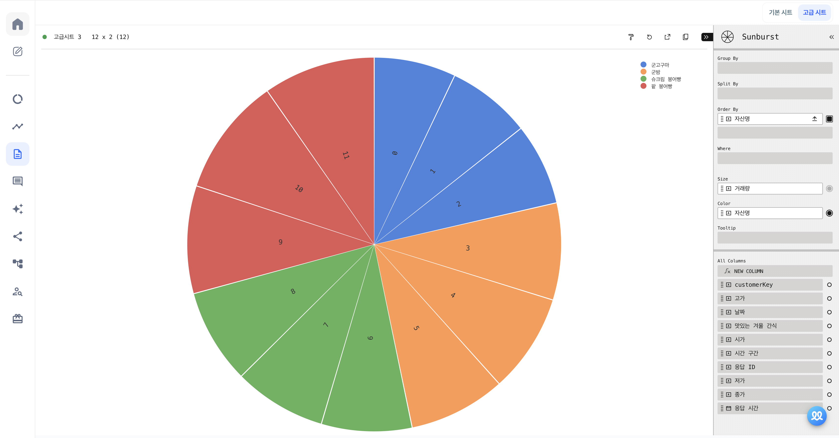
A Sunburst chart is a circular chart used to visualize hierarchical data, often used to show how much each data item contributes to the whole.
- Heatmap
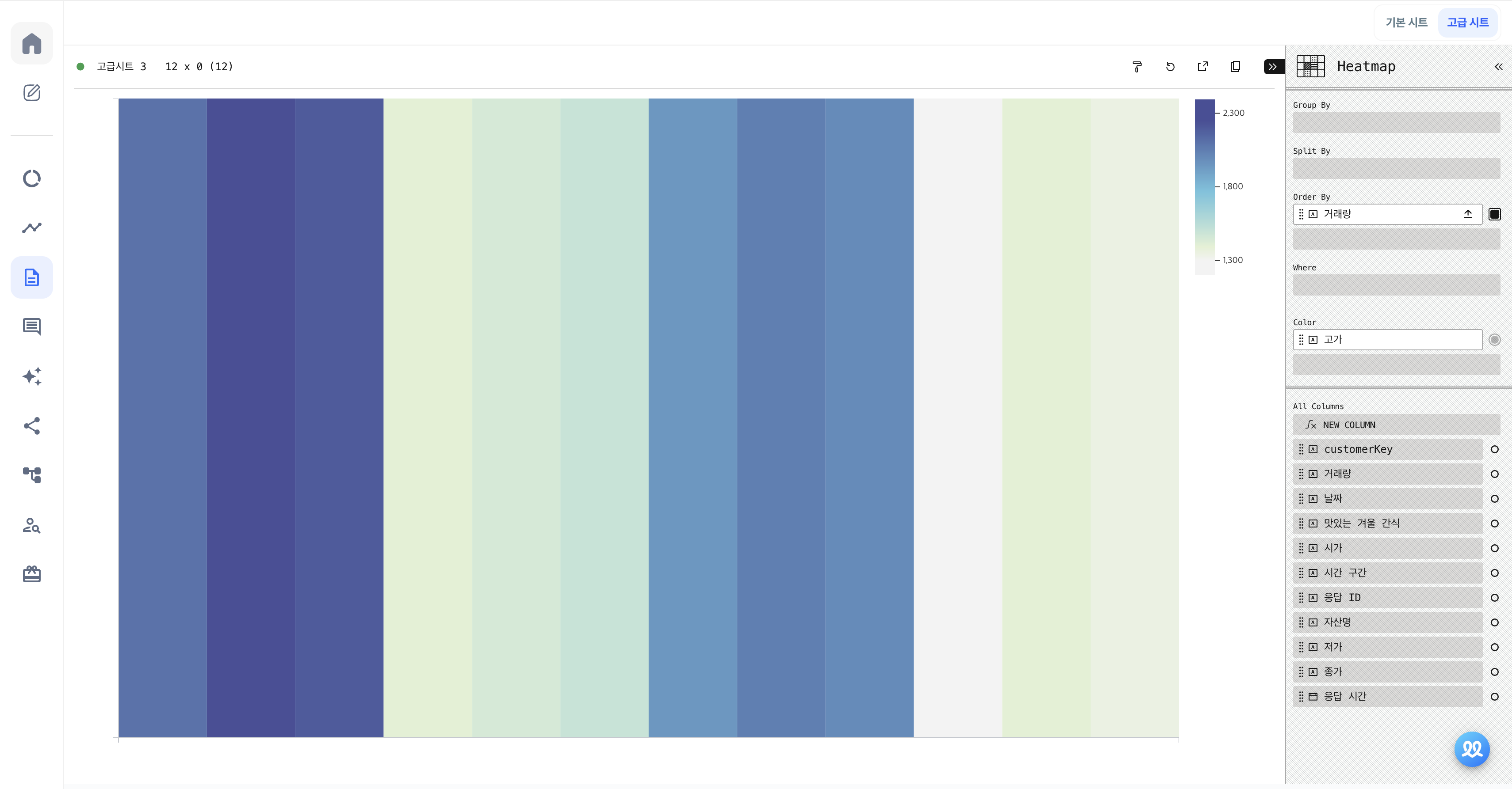
A Heatmap is a chart that visualizes data values through color. The intensity or tone of the colors changes based on the size of the values, making it easy to visually identify patterns or trends.
- X Bar
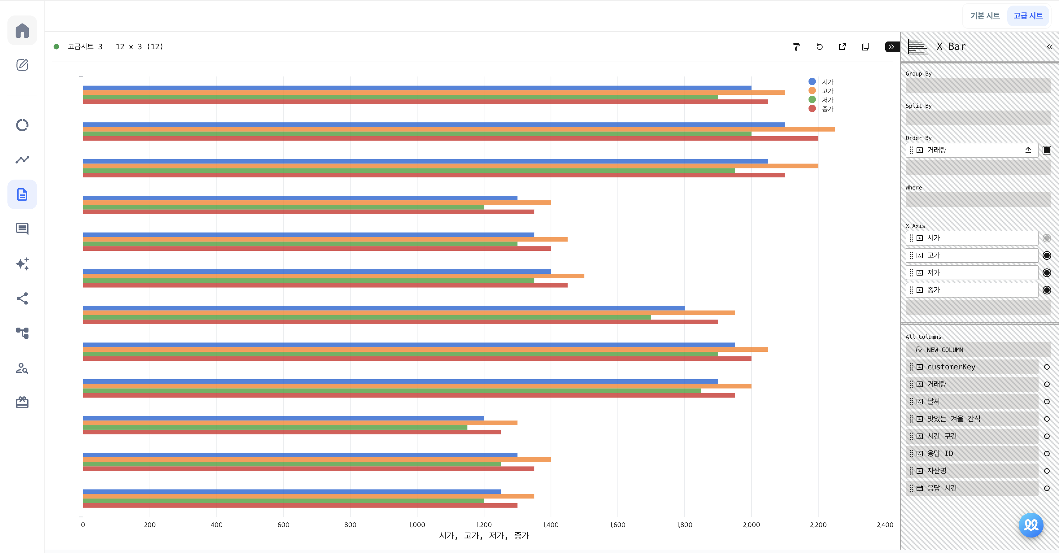
The X Bar chart type visualizes data comparisons along the X-axis, commonly known as a horizontal bar chart. You can add multiple fields to the X axis to compare various data points.
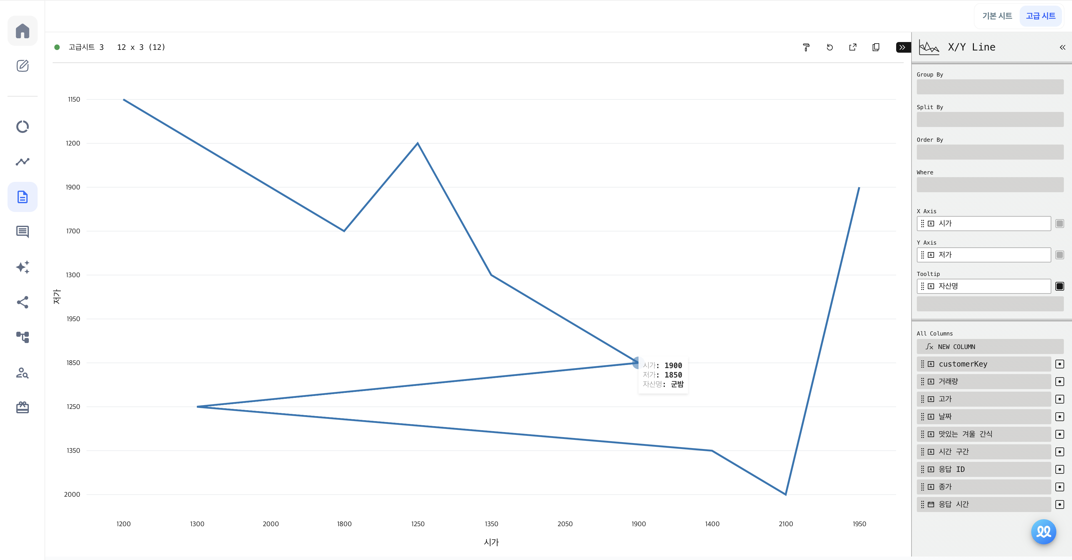
- X/Y Line
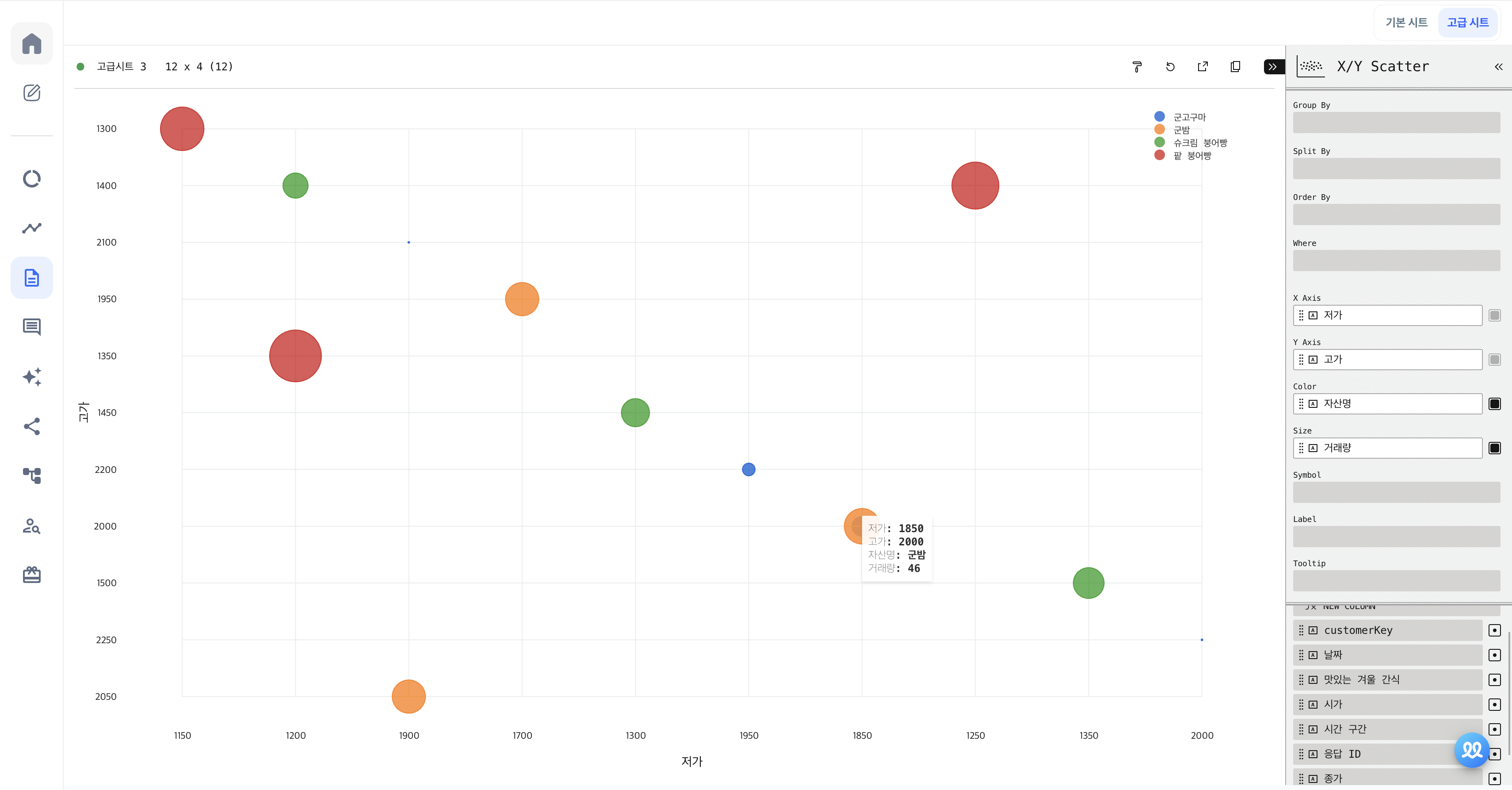
- X/Y Scatter
- Y Bar
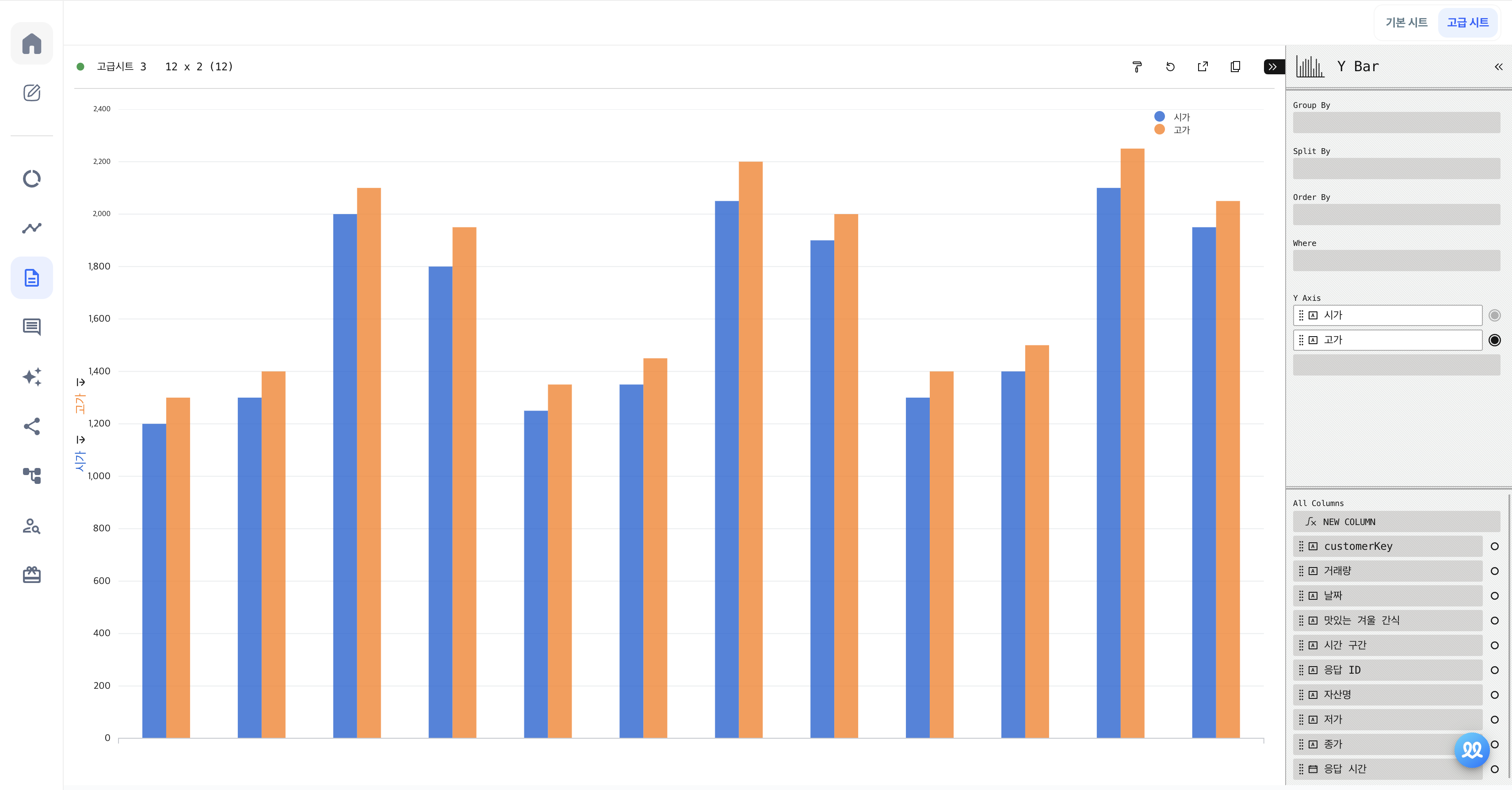
The Y Bar chart type visualizes data comparisons along the Y-axis, similar to a horizontal bar chart. You can add multiple fields to the Y axis for comparison.
- Y Line
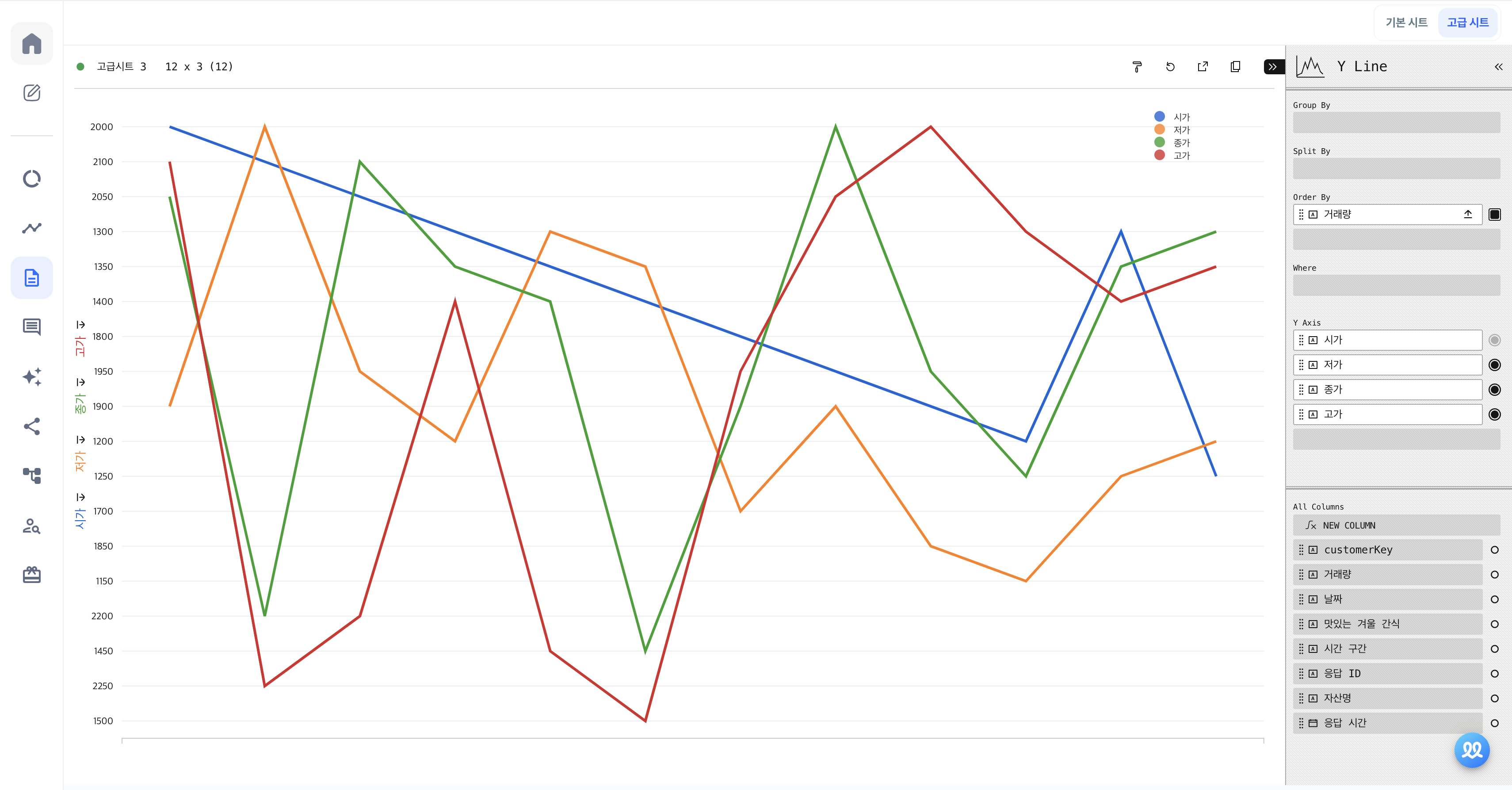
The Y Line chart connects data points along the X and Y axes with lines to visualize trends over time.
- Y Area
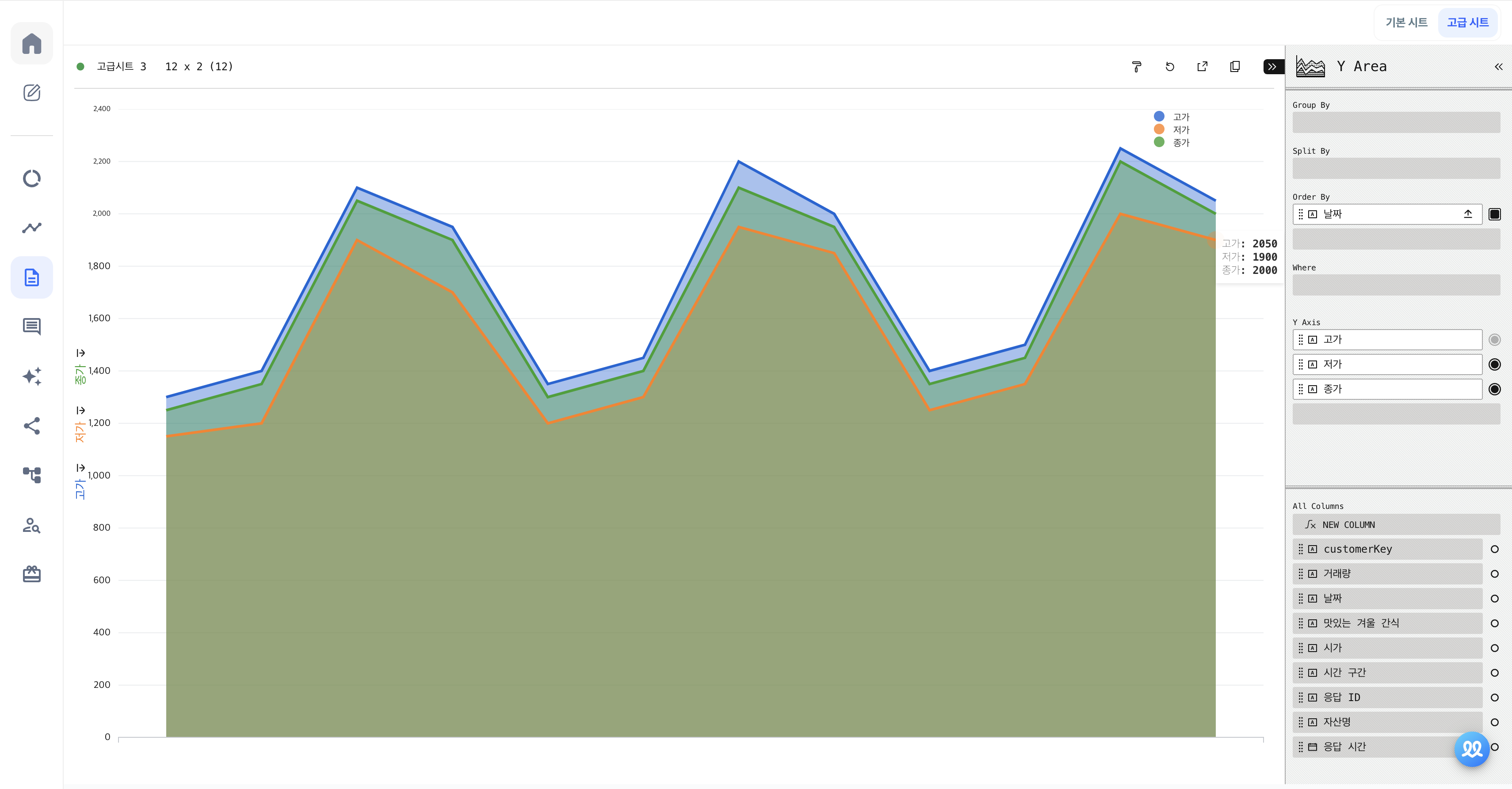
The Y Area chart represents values as areas, typically used to show changes over time. It's similar to a line chart but with the area under the line filled in to emphasize the values.
- Y Scatter
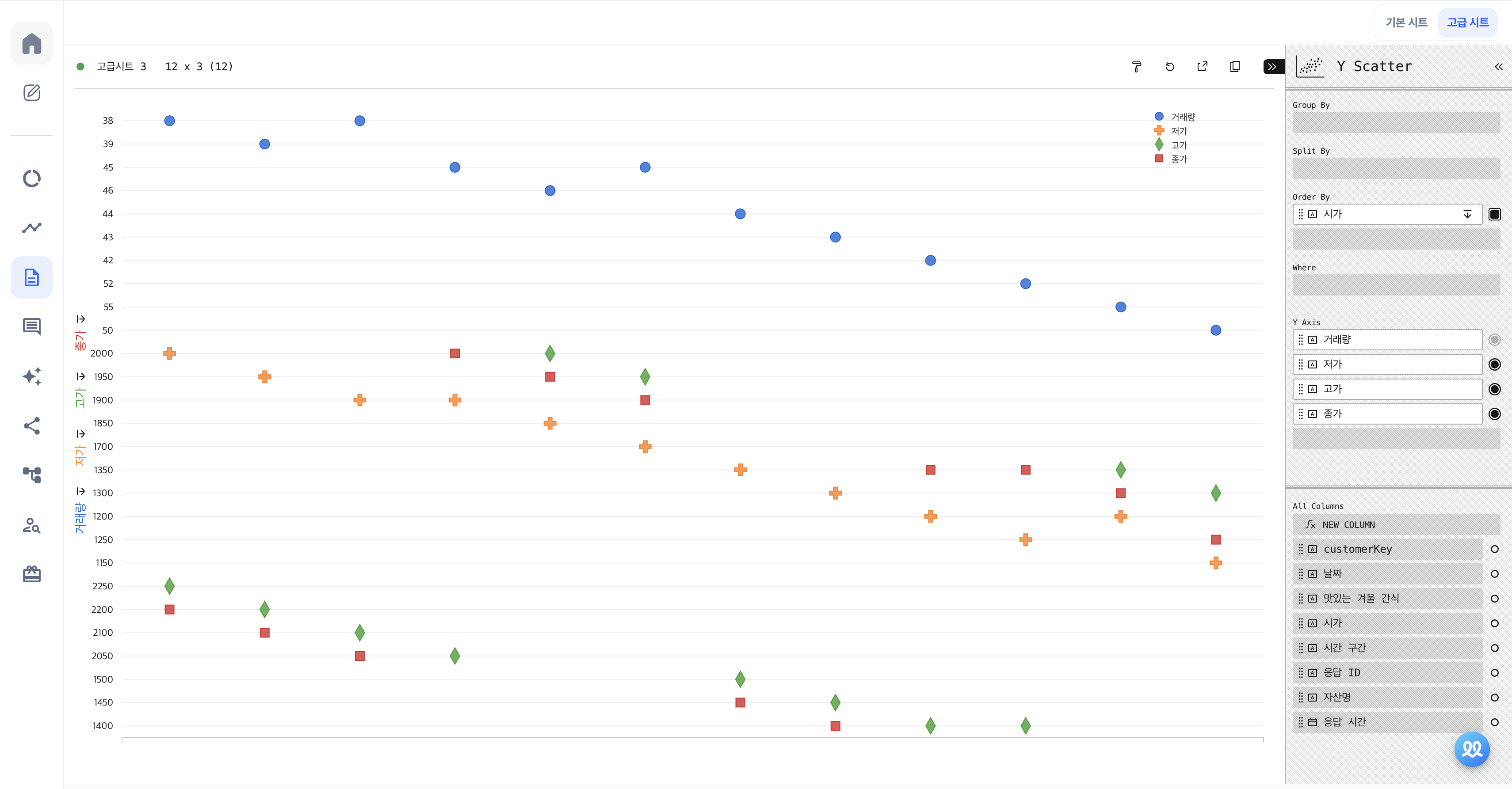
The Y Scatter chart plots data points along the X and Y axes to create a scatter plot.
- OHLC
The OHLC chart stands for Open, High, Low, and Close, and is used to visually represent the price changes of an asset.
- Candlestick
A Candlestick chart is similar to an OHLC chart and is used to visualize asset price changes.
Do you want to check Walla's future development plans or suggest new features?
Click Product
Roadmap and Feature Suggestions